Textural Sculptures: Elevating the Modern Lounge with Sherpa Boucle Accent Chairs
- Dana Mulqueen

- 5 days ago
- 15 min read
In the world of high-end interior design, we often talk about "structural weight": the idea that a room needs something permanent, like a marble fireplace or a custom built-in, to feel expensive. But as we move deeper into 2026, the industry is shifting. We are entering the era of the "sculptural anchor," where furniture doesn’t just fill a space; it defines it.
At Modernize Methods LLC, our "No-Demo" philosophy is built on this exact principle. You don't always need a sledgehammer to achieve a luxury home remodeling result. Sometimes, you just need a pair of chairs that act as functional art. Enter the CHITA Accent Chair (Set of 2).
These aren't your standard builder-grade armchairs. They are a masterclass in texture and silhouette, blending Mid-Century Modern heritage with the tactile cravings of modern luxury. In this editorial, we’re diving deep into why these chairs are the ultimate tool for a high-impact, low-stress modern home renovation.
The Anatomy of a Modern Classic
What makes a piece of furniture look expensive? It’s rarely the price tag alone. It’s proportion, restraint, material contrast, and the subtle tension between softness and structure. The CHITA Accent Chair (Set of 2) hits that formula beautifully by blending tactile comfort with architectural detail in a way that feels current, elevated, and highly usable in real life.
Faux Sherpa (Boucle) Texture: 2026 is the year of soulful interiors. The flat, sterile minimalism of the 2010s has officially lost its grip, and clients now want rooms that feel soft, layered, and human. The ivory sherpa texture delivers that emotional warmth immediately. It reads cozy from across the room and luxurious up close, which is exactly what we want in strong interior design.
Solid Rubberwood Arms: Natural wood is one of our favorite design cheat codes because it instantly adds credibility to a piece. These armrests give the chairs visual grounding and a custom-furniture feeling that helps them play far above their price category.
Antique Brass Metal Frame: The thin brass-toned frame adds the linework. That matters. Without it, the chair could skew too soft or too casual. The metal detail keeps the silhouette crisp, editorial, and refined.
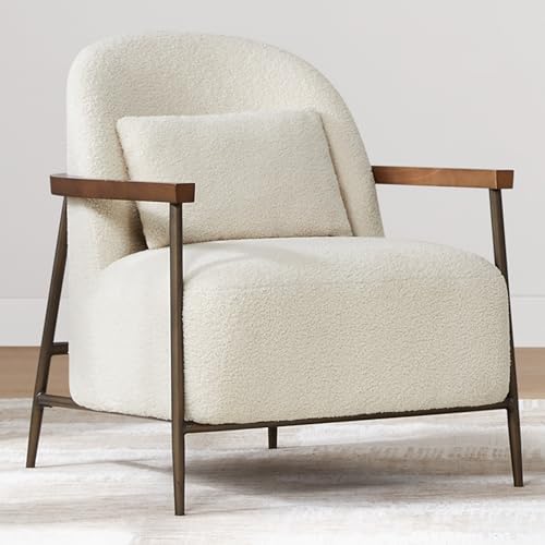
A lot of homeowners assume a room needs bigger architecture to feel expensive: coffered ceilings, custom wall paneling, a full fireplace rebuild. Those upgrades can absolutely be beautiful, but they’re not always necessary to achieve a high-end result. In many projects, especially when we’re leading a fast-turn modern home renovation strategy, what the room really needs is a stronger anchor. Something with enough personality to reset the tone of the entire space without requiring demolition.
That is exactly where these chairs shine. They don’t disappear into the background. They create texture, soften harsh geometry, and give a dated room a more collected point of view. That’s why we use pieces like this in our renderings so often. They help a client see, in very practical terms, how a room can pivot from generic to polished through styling, balance, and better curation rather than dust-heavy construction.
The Feng Shui of Tactile Softness
Modern rooms often lean heavily into what Feng Shui would classify as Yang energy: strong corners, linear casework, black-framed windows, slab-front cabinetry, polished stone, hard flooring, and crisp architectural edges. All of that can be stunning, but without a counterbalance, it can start to feel a little emotionally cold. Beautiful, yes. Restorative, not always.
This is where the CHITA chairs become more than seating. They become energetic correctives.
Their rounded silhouette introduces a Yin softness that modern spaces desperately need. Look at the curve of the seat, the gentle wrap of the back, the inviting depth of the cushion. These are not aggressive lines. They signal ease. Then add the plush sherpa texture, and suddenly the room doesn’t just look curated; it feels calmer. Softer. More livable.
In Feng Shui terms, tactile softness has a regulating effect. When a room is dominated by hard surfaces and visual sharpness, soft texture helps slow the eye and relax the nervous system. It creates a sense of welcome. It encourages pause. That matters in a lounge, a reading corner, a bedroom sitting area, or even a formal living room that previously looked nice but felt too stiff to use.
From an interior design perspective, this Yin-Yang balance is also what makes a room photograph so well. If every surface is sleek, the image falls flat. If every piece is plush, the space loses structure. The magic is in the contrast. A pair of sherpa chairs against white oak floors, a clean-lined plaster wall, or a sharply tailored sofa creates the layered tension we associate with luxury editorials.
This is one of the reasons we often recommend these chairs for clients who say, “My room looks modern, but it doesn’t feel finished.” Usually what they mean is that the room has enough architecture but not enough softness. Enough correctness but not enough intimacy. The answer is not always more built-ins. Sometimes it’s a better emotional counterweight.
Concept 1: The Grand, Sun-Drenched Great Room

Imagine walking into a living room with white oak floors, a minimalist plaster fireplace, and a flood of natural light. In a traditional luxury home remodeling project, you might spend $20,000 on custom millwork to fill that space.
Instead, we recommend a No-Demo anchor strategy. By placing a pair of the CHITA Accent Chair (Set of 2) in the center of the room, you create an immediate focal point. The ivory fabric reflects the sunlight, while the sculptural silhouette breaks up the flat planes of the floor and walls.
This is the core of our Visual Design Recommendation Plan. For a flat fee of $1565 per room, we show you exactly how to layer these elements: lighting, rugs, and statement furniture: to get the Architectural Digest look in 1-2 weeks, not months. You get the full-color renderings and the exact shopping list, ensuring that when you hit order on those chairs, they land in a room that is ready to receive them.
In a great room, these chairs work best when they are allowed to breathe. We like to float them slightly off-axis from the main sofa instead of shoving them flat against a wall. That one move makes the space feel more conversational and less like a furniture showroom. Add a richly toned rug, a round drink table, and one oversized lamp, and suddenly the room gains rhythm.
These chairs also solve a problem many open-concept homes have: too much visual sprawl. A giant room can start to feel vague if the furniture lacks sculptural identity. Because the CHITA silhouette has enough presence, it helps carve out a lounge moment inside a larger footprint. In practical terms, that means the room feels more designed without adding a single wall.
The "No-Demo" Philosophy: Design Without the Dust
The biggest deterrent to modern home renovation is the mess. The noise, the contractors, the six-month lead times: it’s exhausting. At Modernize Methods LLC, we’ve flipped the script. We believe that 90% of a room’s wow factor comes from what is in it, not what is behind the drywall.
By focusing on high-quality textures: like the FSC Certified Sherpa fabric on these chairs: and architectural lighting, we can transform a space in a fraction of the time. Whether you’re an Airbnb host looking to maximize your ROI or a busy executive who wants a luxury retreat, the No-Demo approach delivers a bespoke result without the renovation headache.
The key is intention. No-Demo does not mean random online shopping and hoping for the best. It means creating a visual hierarchy on purpose. First, we define the room’s focal elements. Then we correct scale, improve contrast, build a palette, and layer lighting so the room feels dimensional throughout the day. It is a methodology, not a shortcut.
For many of our clients, this is a smarter path than traditional construction-led luxury home remodeling. You still get transformation. You still get polish. You still get that before-and-after thrill. But you avoid unnecessary upheaval, inflated timelines, and expensive decisions made too early.
Concept 2: The Moody Executive Sanctuary

Luxury isn't just about white-on-white. In an executive home office, we lean into the moody side of the palette. Dark walnut cabinetry, charcoal textured walls, and heavy drapery create a sense of gravitas. But a dark room needs a pop of light to keep it from feeling oppressive.
We often specify the camel-toned CHITA chairs for these corners. The warm, toffee-brown sherpa adds a layer of quiet luxury that feels lived-in and professional. Paired with a marble side table and a brass floor lamp, this setup becomes the perfect place for a 4 PM coffee or a deep-dive strategy session.
This transition from construction-heavy design to curated-layering is why our Visual Design Recommendation Plans are so popular. We take the guesswork out of the color story, ensuring your moody room feels sophisticated, not just dark.
Aging-in-Place: Structural Support without the Clinical Look
One of the most overlooked categories in high-end interior design is aging-in-place. Too often, people hear that phrase and immediately picture something sterile, overbuilt, or medically styled. That’s exactly the disconnect we try to eliminate. Supportive design should never feel clinical if it is handled correctly. It should feel seamless, dignified, and beautiful.
That’s why these chairs are so useful for luxury aging-in-place clients. The 17.9-inch seat height is an important detail. It creates a sit that feels accessible rather than overly low and sinky, which matters for clients who want a stable transition in and out of a chair. If a seat is too deep or too low, it can look chic in a photo but perform terribly in daily life. A supportive height changes that.
Then there are the solid wood armrests. This is not just a visual win; it’s an ergonomic one. Firm arm support gives users a reliable place to brace lightly as they sit or stand. That one feature can make a stylish lounge chair dramatically more functional for older adults, recovering clients, or anyone who simply values comfort with better body mechanics.

What we love here is that the structure is hidden in plain sight. The support does not announce itself. The chair still reads editorial. It still works in a tailored living room, a sophisticated den, or a boutique-style bedroom. That is the sweet spot in luxury aging-in-place design: creating safer, smarter environments that do not sacrifice aesthetic credibility.
In our luxury home remodeling work, this often means selecting pieces that do double duty. They need to photograph well, feel elevated, and quietly support long-term livability. The best design solutions do not force a client to choose between beauty and function. They collapse that false choice entirely.
The Airbnb ROI Factor
If you are an Airbnb host, you are not just furnishing a room. You are building a visual sales funnel. Before a guest reads your description, checks your amenities, or compares your cleaning fee, they see your thumbnails. That first visual hit determines whether they keep scrolling or click.
That is why textural seating like this matters so much.
In listing photography, smooth neutral furniture can disappear. It may be tasteful in person, but on a phone screen it often reads flat. Sherpa, boucle, and visibly tactile surfaces perform differently. They catch light, create shadow, and communicate comfort instantly. These chairs are scroll-stopping because the eye can register their softness even in a small image.
For Airbnb hosts, the ROI logic looks like this:
Thumbnail Advantage: A pair of sculptural sherpa chairs adds obvious visual interest to your lead listing image.
Perceived Luxury: Texture, wood, and brass together imply a more premium furnishing story than generic upholstered seating.
Brand Differentiation: Guests remember listings that feel designed, not assembled.
Rate Justification: A stronger visual narrative helps support higher nightly rates because the property appears more curated and more boutique.
Guest Experience Continuity: When the photos match the in-person feel, reviews tend to reflect that consistency.
Let’s get more specific. If you style these chairs in a corner with a floor lamp, a drink table, and a soft rug, you’ve created a moment. And moments book. Guests are not simply paying for square footage; they are paying for the fantasy of the stay. A chair becomes the place where they imagine morning coffee, evening wine, or a quick photo before dinner. That emotional suggestion is marketing gold.
The best-performing Airbnb spaces usually have at least one area that feels editorial. Not overdesigned. Just intentional enough to tell a story. These chairs do that very efficiently because they bring in texture, warmth, and silhouette all at once. For hosts pursuing a more upscale audience, that matters. It positions the property closer to boutique hospitality and farther away from basic rental inventory.
We also like these for hosts because they are versatile across property types. A downtown condo, a suburban executive rental, a wine-country retreat, or a mountain-view guest suite can all benefit from this kind of seating. The key is framing them correctly in photos and supporting them with a cohesive palette.
Concept 3: The Boutique Hotel Master Suite

Why do we love high-end hotel rooms? It’s the residential-chic lounge area. That small seating group near the window is what makes a bedroom feel like a suite.
In a luxury home remodeling context, we use these chairs to create this exact vibe. The low-slung profile is key here: it keeps the sightlines open, making the bedroom feel larger. The medium-firm seat is ideal for these spaces; it provides enough support for reading or working on a laptop without the sinking feeling of a lounge sofa.
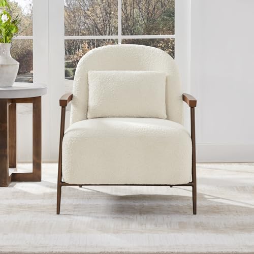
The included lumbar pillow is especially useful in bedroom lounge styling because it finishes the silhouette and adds a little extra softness where clients actually feel it. In a suite-style setup, details like that matter. They make the seating area feel less staged and more hospitable. The result is a room that reads like boutique hospitality rather than standard residential overflow furniture.
We also love this pairing for primary bedrooms that have awkward empty corners. Instead of filling that zone with a generic bench or accent chest, two sculptural chairs and a table create a destination within the room. That changes how the bedroom functions. It becomes a retreat, not just a place to sleep.
Deep Dive: The "No-Demo" Transformation Manual
Let’s walk through how Modernize Methods would actually use these chairs in a real-world transformation. Imagine a dated living area with waiting-room energy: beige walls with yellow undertones, a too-small rug, one overhead light, bulky reclining furniture, and no real focal point. The space isn’t broken, but it feels tired, generic, and disconnected from the homeowner’s goals.
Here’s how we would reshape it in 10 days without opening a wall.
Day 1: Measure, Photograph, and Define the Problem
We start with room dimensions, natural light notes, traffic flow, and photo documentation. Then we identify what’s making the room feel stale. Usually it’s some combination of poor scale, weak contrast, mismatched finishes, and lighting that does nothing for the architecture.
Day 2: Establish the New Vision
Next we build the concept. For this room, the goal is a high-end lounge feeling: tailored, textural, warm, and a little editorial. Not flashy. Not trendy for the sake of it. Just elevated and easy.
Day 3: Reset the Color Story
Paint does heavy lifting in any modern home renovation plan. For a waiting-room-style space, we would likely shift from flat builder beige to one of these cleaner, richer directions:
soft mineral greige for a bright, sophisticated envelope
muted mushroom taupe for warmth without yellow
pale clay-beige for a more organic, European feel
deep warm charcoal on a feature wall if the room can handle mood
The point is to create a backdrop that supports texture rather than fighting it.
Day 4: Remove the Wrong Furniture
This is where most transformations speed up. We edit first. Oversized reclining seating, spindly side tables, and random storage pieces come out. The room needs breathing room before it can become elegant.
Day 5: Anchor the Seating Plan
Now we introduce the CHITA Accent Chair (Set of 2) as the textural hero. Depending on the room, they either face the sofa or angle toward the fireplace or media wall. Their job is to instantly pull the room out of that waiting-room category and into lounge territory.
Day 6: Correct the Rug and Add Contrast
A dated room often has a rug that is either too small or too busy in the wrong way. We swap it for something larger with subtle pattern and tonal depth: think olive-charcoal geometry, ivory-and-taupe abstraction, or a handwoven look with visual weight. This grounds the chairs and gives the whole room credibility.
Day 7: Layer the Lighting
One ceiling fixture cannot carry a luxury room. We add a floor lamp near the chairs, a table lamp with a linen shade across the room, and often picture lighting or accent lighting if there is art or shelving. Layered lighting is one of the fastest ways to make a room feel finished.
Day 8: Introduce Hard-Surface Counterpoints
The chairs are soft and tactile, so we balance them with harder materials. This usually means a stone drink table, smoked glass accents, darker wood, or aged brass details. Good interior design is rarely about one beautiful object. It’s about how opposing materials make each other look better.
Day 9: Style the Vignette
This is where the editorial quality comes in. A throw is draped casually, not perfectly. A ceramic bowl, a design book, and one sculptural object land on the table. Maybe there’s a tonal pillow on the sofa and a large branch arrangement nearby. The room starts to feel inhabited by someone with taste, not just furnished.
Day 10: Final Review and Client Shopping Roadmap
We review the room as a total composition and finalize the shopping list. This is where our flat-fee process becomes especially useful. Clients know exactly what to buy, in what order, and how it will come together. That clarity is what makes No-Demo transformation actually work.
This 10-day rhythm is why our approach resonates with busy homeowners, executives, developers, and hosts. It respects time, budget, and aesthetics all at once. And it proves that a smart luxury home remodeling outcome does not always require a contractor convoy in your driveway.
Commercial-Luxe Appeal
Not every accent chair needs to live in a private residence. These also make a strong case for boutique office lobbies, executive waiting areas, private client lounges, and luxury hotel suites where the goal is to create a Residential-Luxe atmosphere.
Commercial spaces often get the balance wrong. They either go too corporate and cold, or they try to feel residential and end up looking casual. These chairs thread the needle nicely. The FSC-certified fabric story adds a values-driven layer, the wood and brass detailing elevate the silhouette, and the overall form feels inviting without reading sloppy.
In a boutique office lobby, they can soften a space with stone floors, glass walls, and linear reception desks. In a private wealth office or creative agency, they signal hospitality instead of intimidation. In a hotel suite, they support the kind of textural, high-touch atmosphere guests now expect from premium stays.
This is a strong example of where interior design and brand perception overlap. The furniture in a commercial setting tells visitors what kind of experience to expect. Softly sculptural seating says comfort, taste, and confidence. It suggests the brand understands people, not just appearances.
Why Flat-Fee Design is the Future
The traditional interior design model is broken. Hourly rates and opaque markups lead to budget creep and endless delays. We’ve replaced that with a transparent, streamlined approach.
Our Visual Design Recommendation Plan is a $1565 investment in your peace of mind. You receive:
Full-Color 3D Renderings: See your space transformed with our curated selections before you spend a dime on furniture.
Element Sheets: A detailed breakdown of every color, texture, and finish.
Shopping Lists: Direct links to every item, from the chairs to the lighting fixtures, so you can execute the look on your timeline.
Whether we are working on a luxury RV redesign or a commercial buildout, the process remains the same: 1-2 weeks to a complete vision.
That speed is a huge reason clients come to us. Traditional design timelines can drag on for months before a room even starts to feel resolved. Our system is built for people who want high-end clarity faster. The renderings remove the guesswork. The element sheets create consistency. The shopping list eliminates the scavenger hunt.
It also creates better decision-making. Instead of reacting emotionally to isolated pieces, clients can evaluate the room as a whole. That’s where better outcomes happen. The room becomes more cohesive, more intentional, and far more likely to deliver the sophisticated result they were hoping for from the beginning.
How to Style Your Textural Sculptures
Once your chairs arrive, the styling is what seals the deal. Here are our design consultant secrets for making the CHITA chairs look like they cost three times more:
1. Contrast is King
If you have the ivory sherpa chairs, don't put them on a white rug. Use a rug with some visual weight: perhaps a deep olive or a subtle geometric pattern with charcoal lines. This anchors the chairs and makes the white fabric glow.
2. The Power of Three
Always style chairs in relation to a side table. If you have two chairs, place a singular, substantial side table between them. A stone or ceramic table provides a hard-surface contrast to the soft sherpa fabric.
3. Verticality
Because these chairs are low-profile, you need to introduce vertical elements nearby to balance the room. A tall floor lamp (like our favorites mentioned in our media room design guide) or a large-scale indoor plant will draw the eye upward and make the seating area feel more grounded.
4. Keep the Palette Edited
Textural furniture looks most expensive when the surrounding palette stays controlled. Let the sherpa, wood, and brass do the talking. We usually recommend layered neutrals with one earthy accent tone rather than six competing colors.
5. Mix Tailored and Organic Shapes
If the chair is soft and rounded, let nearby pieces bring in discipline. A square-edged table, a linear lamp, or a framed abstract piece creates the balance that makes the seating area feel sophisticated rather than overly fluffy.
6. Give It a Reason to Exist
The best vignettes are functional. Add a reading lamp, a drink table, and a soft throw so the chairs feel usable, not decorative. Great interior design always supports a lifestyle, even in the most editorial-looking room.
Conclusion: Reality vs. Concept
In the world of interior design, the biggest challenge is the expectation gap. You see a beautiful photo, you buy the items, and somehow it doesn't look the same in your house.
Our mission at Modernize Methods LLC is to close that gap. By using our Visual Design Recommendation Plans, you aren't just buying furniture; you are buying a professionally curated environment. The No-Demo way isn't about doing less; it's about doing smarter.
If you’re ready to build a room that feels softer, sharper, and more intentional without the usual renovation stress, this is exactly the kind of piece we love to start with. The CHITA Accent Chair (Set of 2) proves that one smart selection can shift the entire emotional tone of a room.
For homeowners pursuing a polished modern home renovation, for hosts trying to elevate perceived value, and for clients seeking better aging-in-place support without sacrificing style, these chairs check a surprising number of boxes. And when paired with a professional visual plan, they become even more powerful.
Ready to transform your lounge into a textural masterpiece? Let’s start with a pair of sculptural chairs and a plan that brings it all together.
Modernize Methods LLC: Concept to Reality in 1-2 Weeks.
Comments